
Last updated 10 September 2026
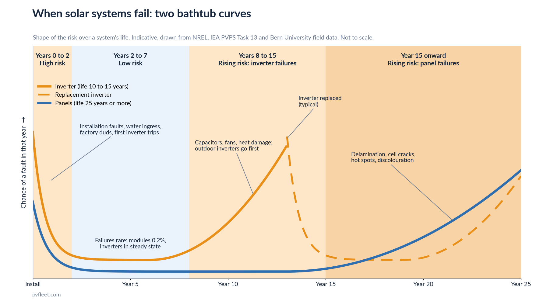
Quick answer: Solar systems fail in a bathtub pattern. Most early faults show up in the first year or two (installation errors, water ingress, dud components), there is a quiet stretch from roughly year 3 to year 7, and then inverter failures climb from about year 8 onward, earlier for inverters mounted outdoors. Panel wear out mostly arrives after year 15. Put the hands on inspections where the risk is, let monitoring watch the quiet years, and don’t drop anything your insurer, network or state electrical rules require.
If you look after solar on more than a couple of buildings, sooner or later someone asks how often the systems should be inspected. The usual answer is “every year”, and to be honest that number is a habit rather than a finding. Nobody worked it out from failure data. So I went and read the failure data: the big NREL field studies from the US, the IEA PVPS Task 13 review of module failures, a Swiss survival study of 2,000 inverters, the Clean Energy Regulator’s inspection results here in Australia, and a 2026 UNSW paper on why some panels die early. The picture that comes out is consistent, and it doesn’t look like a calendar with a visit every twelve months.
What does the failure curve of a solar system look like?
Engineers call it a bathtub curve. Failures are high at the start, drop to a low steady level, then climb again as the equipment wears out. The IEA PVPS Task 13 Review of Failures of Photovoltaic Modules lays it out for panels in three phases: infant failures, midlife failures and wear out failures, each with its own list of causes.
The important thing for scheduling is that a solar system has two bathtubs, not one. Panels have a long, shallow one that plays out over 25 years or more. Inverters have a much shorter one, compressed into 10 to 15 years, and it’s the inverter curve that drives most of the faults you’ll actually deal with. An NREL inverter reliability assessment puts it bluntly: in utility scale systems the mean time between failure of inverters has been shown to be 300 to 500 times shorter than for modules, and in one 27 month operator study module failures accounted for 5% of lost energy while inverter failures accounted for 36%.
Years 0 to 2: the infant failures
This is the busiest period, and the evidence for it is strong.
NREL’s PV Fleet Performance Data Initiative looked at 1,128 commercial and utility systems and found that inverter availability is at its lowest in the first six months of operation, then settles to a steady state by the end of the first year. Once settled, the median system is available 99% of the time, and 90% of systems manage at least 95%. DNV ran the same analysis on over 1,100 systems of its own and found the same shape: first year availability is lower than every year after it.
Warranty data says the same thing from the other direction. Solar Insure, a US warranty provider, analysed claims from 100,000 systems over five years and found the average time from installation to first claim was 335 days. Most claims came shortly after installation, which they put down to warranty and installation quality issues rather than wear.
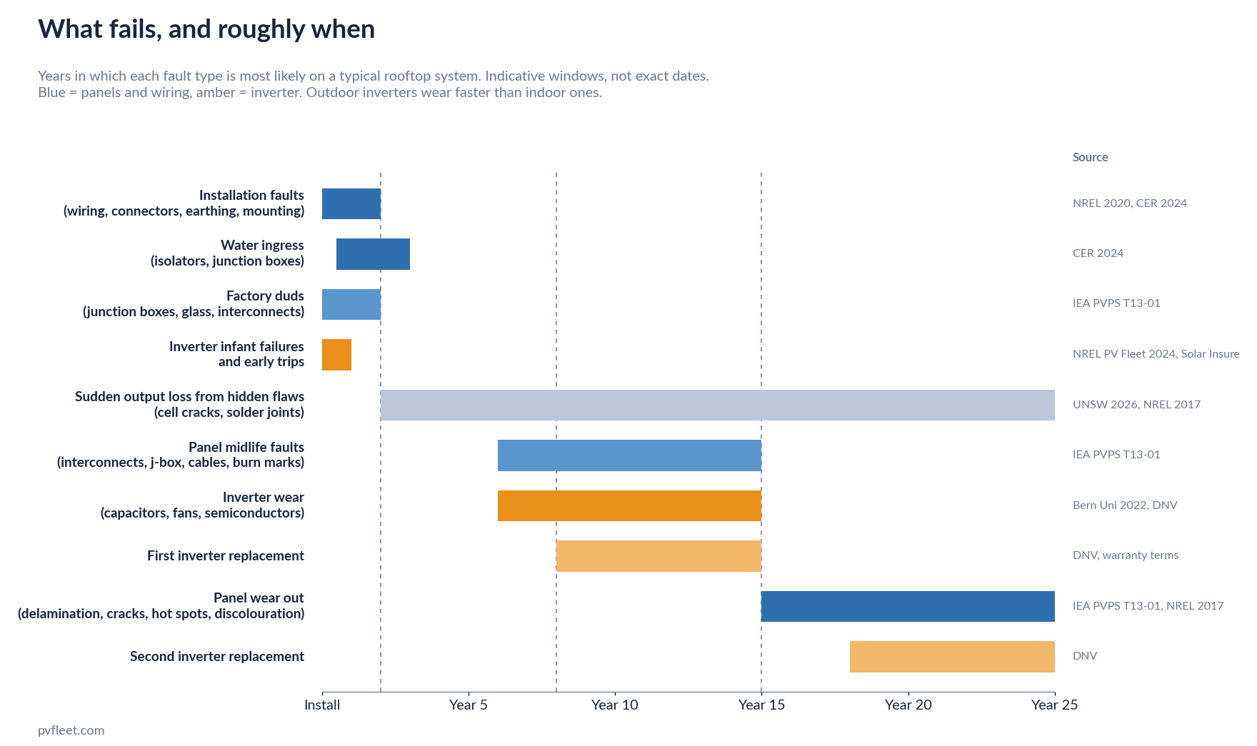
What actually goes wrong early? The IEA PVPS review lists the panel side: junction box failures, glass breakage, defective cell interconnects, loose frames and delamination, plus about 5% of early failures that were simply transport damage. NREL’s analysis of 100,000 US solar systems adds the installation side: connector, wiring, breaker and fuse failures traced back to undersizing, poor electrical design and bad connections.
The Australian data fits. The Clean Energy Regulator’s random inspection program inspects systems 6 to 18 months after installation. Its 2024 update explains that the window used to be 12 to 18 months, partly to give water ingress problems in DC isolators time to appear, and was shortened so safety trends get picked up sooner. Of the 2023 installs inspected, 0.44% were rated unsafe and 24% substandard, with wiring, array mounting and earthing the main reasons. The unsafe rate has dropped a lot since AS/NZS 5033:2021 replaced rooftop DC isolators with disconnection points in most installations, but the substandard rate hasn’t moved, and a quarter of new systems with something wrong is still a quarter.
The UNSW study I mentioned adds one more point. Panels that are going to fail early tend to fail fast, and the ones that survive that first stretch show a slight recovery and a slower degradation rate afterwards. So if a system gets through its first two years clean, the odds are good for the next several.
Years 3 to 7: the quiet stretch
Once the installation faults and factory duds have been flushed out, a solar system is a pretty boring thing. That’s the finding from every large dataset.
In NREL’s 100,000 system study, reported module failures ran at 0.2%, which the authors describe as relatively rare and within historical values. Between 80% and 90% of systems produced within 10% of what was predicted for them, or better. The PV Fleet data, drawn from 25,000 inverters across almost 2,500 commercial and utility sites, puts the median performance loss at 0.75% a year, with 90% of systems losing less than 2% a year. (I go through what counts as a normal degradation rate, and what doesn’t, in a separate post.) Chris Deline, NREL’s group manager for PV field performance, describes the fleet as “not failing catastrophically, but rather degrading at a modest rate within expectations.”
Two caveats for Australia. First, the same NREL data shows systems in hot climate zones lose about twice as much a year as those in cool ones (0.88% versus 0.48%), and most of this country is on the hot side of that line. Second, quiet is not the same as nothing. The UNSW paper, which analysed nearly 11,000 samples from NREL’s own collection, found that while a typical system loses about 0.9% a year, one in five degrade at least 1.5 times faster and one in twelve degrade twice as fast. Some of those would be effectively finished at 11 years. One of the three causes they identify is a minor flaw, like a hairline cell crack or an imperfect solder joint, that does nothing for years and then produces a sudden, severe loss at a random point. An earlier NREL paper on nonlinear degradation found the same thing: encapsulant discolouration gives a smooth straight line, but hot spots from cracked cells, solder bond failures and corrosion give distinctly nonlinear curves.
That matters for how you watch the quiet years. A random, sudden loss of output is exactly the kind of fault a monitoring system sees and a once a year visit misses. I wrote about the common ways systems quietly underperform in an earlier post, and most of them are in this category. It won’t tell you the roof is due for a look; it will tell you which string dropped 30% last Tuesday.
Years 8 to 15: when the inverters start to go
This is the second hump in the curve, and it’s mostly an inverter story.
The best field data I could find is a 2022 study from the Bern University of Applied Sciences, Life Expectancy of PV Inverters and Optimizers in Residential PV Systems, which tracked 2,121 inverters and 8,542 optimisers across 1,195 systems using survival curves. By year 15, 34.3% of inverters had suffered their first yield relevant failure. Where the inverter lives makes a big difference: pv magazine’s write up of the study notes that indoor inverters took about 13 years to drop to 75% survival, while inverters installed outside and exposed to the weather hit the same point after just six to seven years. Systems with optimisers had roughly twice the failure rate of systems without, and the gap between the best and worst manufacturers was about a factor of three.
The industry rule of thumb backs this up. DNV notes that 15 years ago it was common to replace an inverter every five years, and that a modern ground mount inverter can now be expected to last just over ten. Warranties tell you where the manufacturers think the risk sits: in Australia, string inverters typically carry 5 to 10 year warranties against 25 years for panels, so a fair share of the failures in this window land after the warranty has run out. The physics is heat. Thermal cycling lifts bond wires off the power semiconductors, capacitors age with heat and moisture, and an inverter mounted on a west wall in full sun is cycling harder than one in a plant room.
The reason this hump matters more than its percentages suggest is what an inverter failure costs. A cracked panel takes out part of a string. A dead inverter takes out everything behind it, which is why NREL found inverters to be the component that fails most often (4% to 6% of systems) and why Solar Analytics, an Australian residential monitoring company, puts inverter faults at almost half of all major system failures.
Panels have their own midlife issues in this window, though smaller. The IEA review cites a field study of modules from 21 manufacturers after eight years in service, which predicted about 2% of the fleet would fall below warranty by year 11 or 12, mostly through defective interconnects, glass breakage, junction box and cable faults, and burn marks on cells.
Year 15 onward: wear out
Past 15 years, the panel curve turns up. The IEA review of modules with more than 15 years in the field found delamination, cell cracks that isolate part of a cell, and discoloured laminate to be the common failures. The power loss ran between 0% and 20%, averaging about 10%, and nearly all of those modules were still inside their manufacturer’s power warranty. The IEA notes those were older module designs using laminates no longer in production, so treat it as a floor rather than a forecast. Even so, wear out for panels looks more like a slow leak than a failure event, at least for the ones that made it this far.
The exception is hot spots. NREL’s review of failure and degradation modes found that for systems installed in the decade before that 2017 review, hot spots were the top concern, ahead of internal circuit discolouration, and hot spots are one of the failure modes that degrades in jumps rather than a line. This is also the period where the system is probably on its second inverter, and where the original installer may no longer exist.
How to turn this into a maintenance schedule
The point of knowing the curve is to put the effort where the risk is, instead of spreading it evenly across 25 years. Here is how I’d read the evidence for a typical commercial rooftop system with continuous monitoring in place.
| System age | Risk | Hands on work | What monitoring covers |
|---|---|---|---|
| Year 0 to 1 | High | A commissioning check against the design, then a physical inspection 6 to 18 months in (the same window the CER uses) for water ingress, loose terminals, earthing and mounting. Chase anything found while the installer is still answerable for it. | Confirms actual yield matches what was quoted, and catches early inverter trips and string faults. |
| Years 2 to 7 | Low | Only what your insurer, network or state electrical rules require, plus visits triggered by a fault or a measured soiling loss. | Does the watching. The faults in this period are mostly sudden output losses that show up in the data the same day. |
| Years 8 to 15 | Rising | Inverter focused. Check fans, heatsinks and ventilation, look at where the inverter is mounted, and budget for replacement. Treat the first serious fault as the beginning of the end rather than a one off. | Tracks inverter clipping, derating and repeated trips that come before a hard failure. |
| Year 15+ | Rising | Panel focused. Thermal imaging for hot spots, visual checks for delamination and discolouration, and a decision on whether the array still earns its roof space. | Tracks the string level degradation that tells you which sections are wearing out first. |
On skipping the quiet years: for a system that passed its year one check and is monitored continuously, the evidence for a routine hands on visit every year between years 2 and 7 is thin. Panels are failing at a fraction of a percent, inverters are in their steady state, and the faults that do occur announce themselves in the production data. On the other hand, none of this changes what’s written in your insurance policy or your network agreement. If they want a thermographic scan or an electrical test on a fixed interval, that stays, because it’s a safety and compliance requirement rather than a performance one. The risk curve tells you where to add effort and where routine visits are buying you little; it doesn’t tell you to stop meeting obligations.
Three honest caveats. Most of this data is from the US and Europe, because that’s where the large studies have been done. Australia is hotter than most of the sites in those datasets, which pushes both curves a little to the left. And the inverter numbers cover string and central inverters; microinverters and optimisers have their own patterns and less long term data.
Where PV Fleet fits
A risk based schedule only works if something is watching during the years you’re not on the roof. PV Fleet connects to the inverter monitoring your systems already have, any brand, with no new hardware, and puts every site on one dashboard. When a string drops or an inverter stops, you get an SMS or email within hours, not at the next service visit. Each site gets a written monthly report covering generation, faults, data gaps and what to do next, which doubles as the performance record insurers and auditors ask for. So the year 8 inverter that has started tripping every hot afternoon shows up long before it fails for good, and the year 3 string with a cracked cell shows up the week it happens. Pricing is from $790 per site per year, and councils can read how it fits their reporting on the councils page.
If you look after solar on multiple buildings and want to see what the record looks like, book a 15 minute demo. And if you’re planning a new system rather than looking after an old one, the free solar tools will give you roof azimuth, pitch, panel count and expected yield before you talk to an installer.
Related reading
- How fast do solar panels degrade? What the data says is normal, and what isn’t
- Why solar systems quietly underperform, and how to catch it early
- How to work out annual solar generation in MWh across many sites
- How to check how much solar your roof can capture
Sources
- Köntges et al., Review of Failures of Photovoltaic Modules, IEA PVPS Task 13, report T13-01:2014
- Jordan, Marion, Deline, Barnes and Bolinger, PV field reliability status: analysis of 100,000 solar systems, Progress in Photovoltaics 28(8), 2020 (NREL and Lawrence Berkeley National Laboratory)
- Deline et al., PV Inverter Availability from the U.S. PV Fleet, NREL, Photovoltaic Reliability Workshop, February 2024
- NREL, How Extreme Weather and System Aging Affect the US Photovoltaic Fleet, January 2024, summarising Jordan et al., Photovoltaic fleet degradation insights, Progress in Photovoltaics, 2022
- NREL, Photovoltaic Inverter Reliability Assessment, technical report NREL/TP-5D00-74462
- Jordan, Silverman, Wohlgemuth, Kurtz and VanSant, Photovoltaic failure and degradation modes, Progress in Photovoltaics 25(4), 2017
- Jordan, Silverman, Sekulic and Kurtz, PV degradation curves: non-linearities and failure modes, Progress in Photovoltaics 25(7), 2017
- Bucher, Wandel and Joss, Life Expectancy of PV Inverters and Optimizers in Residential PV Systems, Bern University of Applied Sciences, WCPEC-8, 2022
- Willuhn, Elusive longevity, pv magazine, November 2022 (Bern study detail and DNV inverter life estimates)
- Tang, Poddar, Kay and Rougieux (UNSW), Understanding and Reducing the Risk of Extreme Photovoltaic Degradation, IEEE Journal of Photovoltaics, January 2026; reported in Hidden solar system degradation reduces useful life from 25 years to 11: research, pv magazine Australia, 30 January 2026
- Clean Energy Regulator, Inspections update No. 23, Small-scale Renewable Energy Scheme inspections program, 2024
- Solar Insure, Solar Inverter Reliability: A Long Term Claims Analysis, January 2024
- Solar Analytics, Are My Solar Panels Working Properly?