
Last updated 10 September 2026
Quick answer: A solar panel on its own loses about 0.5% of its output a year. A whole system, measured from the inverter, loses about 0.75% a year, because soiling, wiring and small outages add to the panel’s own fade. Hot climates push that closer to 0.9%. Expect a 1% to 2% drop in the first year on top. PV Fleet treats anything up to 1.0% a year as normal, 1.0% to 1.5% as worth watching, and more than 1.5% as a reason to investigate.
Every solar quote comes with a warranty line that says the panels will still make 87% or so of their rated power in 30 years. That’s a promise about the panel, tested in a lab. It’s not a promise about what your roof will produce, and the gap between the two is where most of the confusion about degradation lives. So I went back to the field data, which mostly means NREL in the US, the IEA PVPS Task 13 group, and some recent UNSW work, to work out what a normal degradation rate actually looks like and where the line sits between “ageing” and “something is wrong”. The last section gives the range PV Fleet uses.
What’s the difference between panel degradation and system degradation?
This is the part most articles skip, and it matters. Panel degradation is the slow loss of power inside the module itself: yellowing encapsulant, corroding solder joints, micro cracks, that sort of thing. It’s measured by taking the panel off the roof and flashing it in a lab, or by comparing its DC output over years under matched conditions.
System degradation, which the industry calls the performance loss rate, is what you see in the inverter data. The IEA PVPS Task 13 report Assessment of Performance Loss Rate of PV Power Systems defines it as the decline of a system’s power output over time, and is careful to say it does not just represent the physical degradation of the panels. It also picks up performance losses that may be reversible or even preventable through good operations and maintenance. Dirt that never fully washes off, a string that dropped out for a fortnight, a corroded connector, mismatch between panels: all of it lands in the same number.
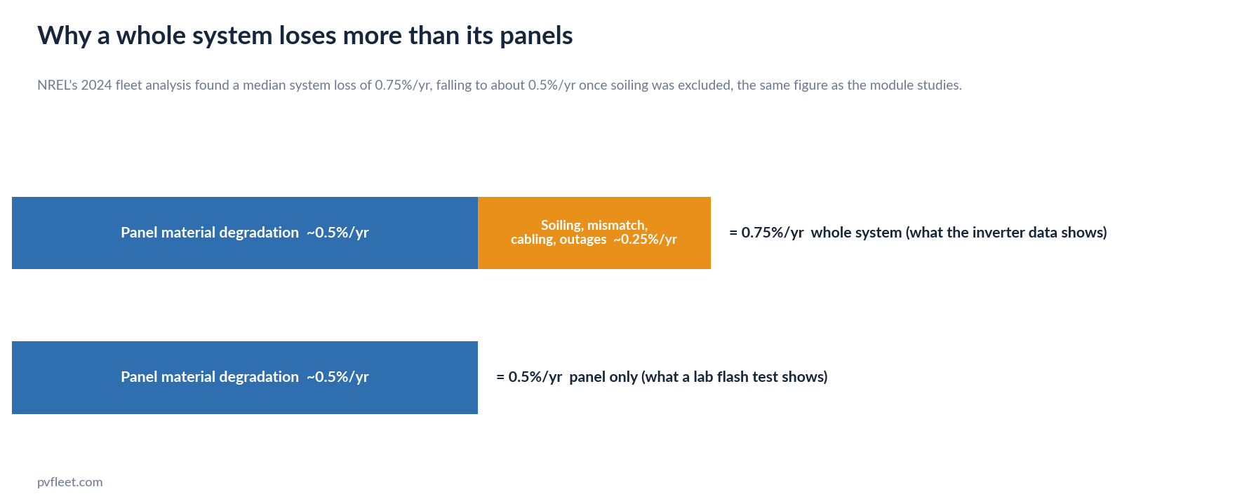
NREL demonstrated the gap directly. Its 2022 fleet paper, Photovoltaic fleet degradation insights, found a median system loss of 0.75% a year and noted that this was slightly higher than the roughly 0.5% seen in module studies, most likely because system measurements include losses like series mismatch, soiling and cabling. The 2024 follow up then did the experiment: when it stripped soiling out of the analysis, the system rate dropped to about 0.5% a year, right back to the module figure. So the two numbers are both correct. They just measure different things, and the one that shows up on your bill is the system one.
How fast do solar panels degrade?
The reference point is NREL’s Photovoltaic Degradation Rates: An Analytical Review by Dirk Jordan and Sarah Kurtz. They pulled together nearly 2,000 published degradation rates, measured on individual modules or whole systems over 40 years, and found a median of 0.5% a year and a mean of 0.8%. The mean is higher because the distribution has a tail of poor performers. Still, 78% of all the reported rates were below 1% a year. Their 2016 follow up compendium grew the dataset to more than 11,000 rates from almost 200 studies in 40 countries and landed in the same place: a median of 0.5% to 0.6% a year for crystalline silicon, with a mean of 0.8% to 0.9%.
There’s an Australian data point buried in the 2013 review. Telstra ran a large PV network for remote telecoms, and 35 mono crystalline modules deployed for eight years in the Melbourne climate showed an average decline of 0.4% a year. That’s an old study of old panels, but it’s about as close to home as the published literature gets.
Current warranties sit a little under the measured median, which is what you’d expect since a warranty is meant to be comfortably met. Jinko’s Australian warranty document for most of its Tiger Neo range allows 1% in the first year, then 0.4% a year, for 87.4% at year 30 (a few newer models are warranted at 0.35%). Trina’s Vertex S+ datasheet for Australia is identical: 1% first year, 0.4% a year after, 87.4% at 30 years. SolarQuotes keeps a running table and says 0.4% is now the warranted figure for most panels going on Australian roofs, with Aiko at 0.35% and premium REC and SunPower panels at 0.25%. Five years ago 0.7% was typical, and some panels on the market are still warranted at 0.55%.
How fast do whole systems degrade?
The best data here is NREL’s PV Fleet Performance Data Initiative, which collects real production data from system owners in exchange for a free analysis. The 2022 paper covered more than 7.2 GW across 1,700 sites and 19,000 inverters, roughly 6% to 7% of the entire US market, and after quality filtering used 4,915 inverters. The median performance loss rate was 0.75% a year, the mean 0.88%, and the P90 was 1.9% a year, meaning 90% of systems lost less than that and 10% lost more. The 2024 report expanded the fleet to 8.5 GW and 24,000 inverter channels and found the same 0.75% median.
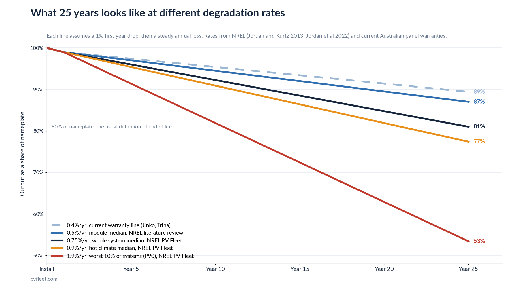
The IEA PVPS Task 13 group ran a similar exercise on its own database of 120 systems in the US and Europe, some running for 17 years, and got medians of 0.63% and 0.71% a year depending on the statistical method. On a smaller set of 19 well instrumented benchmark systems, nine sat between 0.4% and 1% a year, three did better, and six were losing between 1% and 4% a year. That last group is the point. Averages are reassuring; the spread is not.
UNSW put a number on the spread in January 2026. Using NREL’s collection of annual production data covering nearly 11,000 photovoltaic samples worldwide, Yang Tang and colleagues found a typical loss of about 0.9% a year, but at least one in five systems degrading at least 1.5 times faster than that and roughly one in twelve degrading twice as fast. For those systems, useful life could be closer to 11 years. Their explanation is three things: interlocking faults where one problem (say a damaged backsheet) lets in moisture that causes others, infant mortality from manufacturing defects, and minor flaws that sit quietly until they cause a sudden loss. Notably, they found the long tail exists in every climate, so it isn’t a hot weather story.
Does the Australian climate make it worse?
For the typical system, yes, a bit. NREL’s fleet data showed a median loss of 0.48% a year in cooler temperature zones rising to 0.88% a year in hotter ones, and called the trend statistically significant (that analysis covered conventional ground mounted systems, the only group with enough data). Most of Australia’s population lives somewhere that would sit toward the hot end of that scale, though NREL’s zones are defined for the US and I couldn’t find a published mapping of Australian cities onto them, so treat the comparison as directional.
UNSW’s own 2024 modelling of Australian conditions found the same pattern in reverse: degradation rates were higher in hot and humid regions like northern Australia and lower in the dry centre, with thermal degradation identified as Australia’s main degradation precursor. It’s a model rather than a field measurement, but it points the same way as the US data. So if your sites are in Brisbane or Darwin rather than Hobart, a system rate nearer 0.9% than 0.5% is not by itself a sign of trouble.
What happens in the first year?
The first year is different and shouldn’t be counted in the long term rate. Two things happen. New panels lose a little output as soon as they see sunlight, called light induced degradation, and the IEA PVPS 2025 review of degradation in new cell technologies says this mostly happens within the first few hours of exposure and can amount to several percent. The good news is that it has dropped a lot with the shift to gallium doped and n type cells, which is most of what’s sold now. Older p type PERC panels had a nastier version called LeTID that plays out over the first couple of years and, in bad cases, cost more than 10%. Warranties reflect this: n type panels typically allow 1% in the first year and p type panels 2%.
The second thing is that new systems are often still being sorted out: commissioning faults, a string not connected, monitoring not set up properly. The IEA Task 13 report notes that many commercial systems show stable or slightly increasing output over the first year or two before the slow decline begins, and that the yield assessors it surveyed generally assume a 1% to 2% drop in year one. So measure the fade from year two onward, and don’t panic about year one.
What is a normal degradation rate?
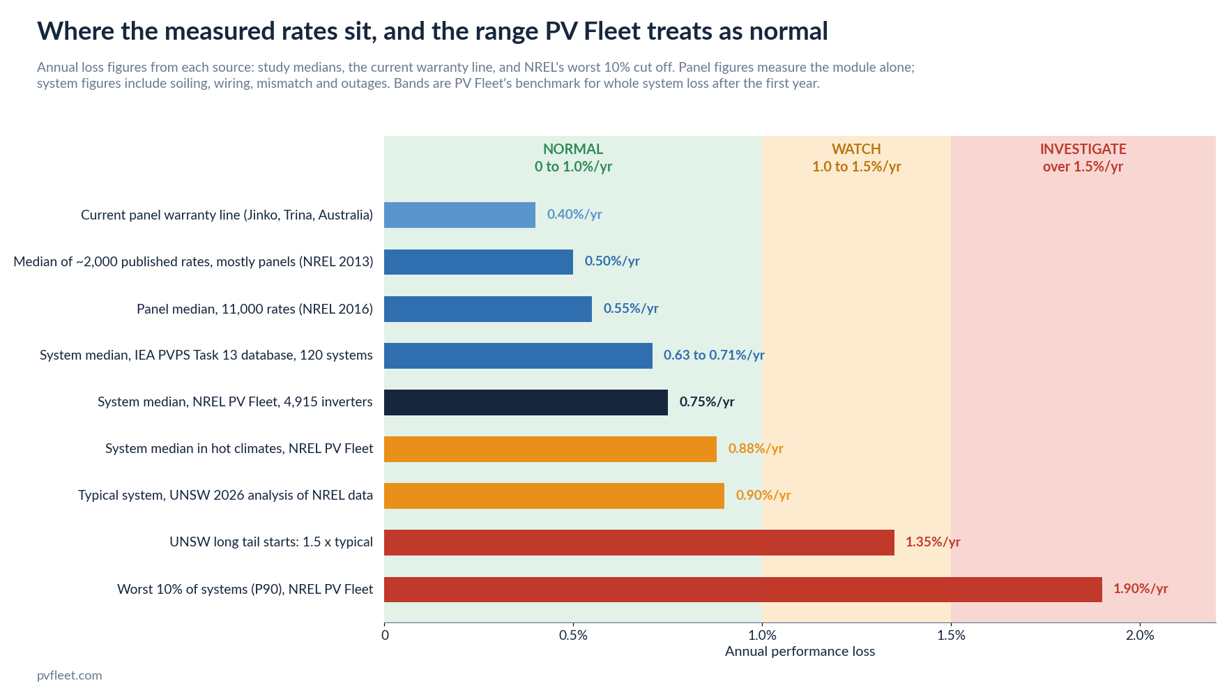
Putting that together, here is the range PV Fleet uses for a whole system’s loss rate, measured from inverter data after the first year.
| Annual loss | PV Fleet reads it as | Why |
|---|---|---|
| Up to 1.0% | Normal | Covers the NREL fleet median (0.75%), the hot climate median (0.88%), the UNSW typical figure (0.9%) and the IEA benchmark band of 0.4% to 1%. Ageing, not a fault. |
| 1.0% to 1.5% | Watch | Above every published median but still inside the NREL P90 of 1.9%. Often soiling or a partial fault that’s fixable. Worth a clean or a string check before assuming the panels are at fault. |
| Over 1.5% | Investigate | Roughly where UNSW’s long tail starts (1.5 times the typical rate) and approaching the worst 10% of the NREL fleet. At this rate a system falls below 80% of nameplate well inside its warranty period. Something is wrong beyond normal ageing. |
Three rules go with the bands. First, you need enough data. The IEA report is blunt that systems with less than two years of data are hard to assess because seasonal patterns swamp the trend, and that a reliable figure needs three to five years. A single bad year is weather, not degradation. Second, measure against what the system should be producing given the sun it actually got, not against the nameplate rating. Jordan’s compendium warns that panels have deviated from their nameplate at the start of life for 35 years, so a rate calculated from the sticker on the back is off before you begin. Third, treat the bands as system numbers. A panel warranty is a panel number, and a 1.2% system rate might be 0.5% of panel fade plus 0.7% of dirt.
What to do if your system is losing more than it should
Work down the list from cheapest to dearest. Soiling first: NREL found annual soiling losses of 0% to 15% among the fleet systems where soiling was detectable, with a median of 2% to 3%, and on low tilt commercial roofs it’s often the whole explanation. A clean and a before and after comparison settles it. Then look for a partial fault, which usually shows as one string or one inverter input lagging the others rather than the whole site fading evenly. The common culprits are in my post on why systems quietly underperform, and the timing of when they tend to show up is in when do solar systems fail.
Only once those are ruled out are you looking at the panels themselves. If the panel level fade is running past the warranty line, that’s a warranty claim against the manufacturer rather than a maintenance job, and the thing that makes the claim stick is a multi year production record showing the trend. Which is a good reason to have the record.
Where PV Fleet fits
PV Fleet connects to the inverter monitoring your systems already have, any brand, with no new hardware, and works out each site’s annual fade rate from its own production history, plotted against the normal, watch and investigate bands above. Because expected output is corrected for the weather each site actually got, a cloudy year doesn’t show up as degradation, and because the history is kept in one place, the trend is there when you need it for a warranty claim or an insurer. Faults that aren’t degradation at all, like a dead string, raise an SMS or email alert within hours, and every site gets a written monthly report that says in plain English what changed and what to do about it. Pricing is from $790 per site per year for commercial sites, and there is a free tier for homeowners.
If you’d like to see what a fleet’s degradation picture looks like, book a 15 minute demo. And if you’re still at the planning stage, the free solar tools will tell you your roof’s azimuth, pitch, panel count and expected yield so you have a proper baseline to measure against later.
Related reading
- When do solar systems fail? Using the research to time your maintenance
- Why solar systems quietly underperform, and how to catch it early
- How to work out annual solar generation in MWh across many sites
Sources
- Jordan and Kurtz, Photovoltaic Degradation Rates: An Analytical Review, Progress in Photovoltaics 21(1), 2013 (NREL/JA-5200-51664)
- Jordan, Kurtz, VanSant and Newmiller, Compendium of photovoltaic degradation rates, Progress in Photovoltaics 24(7), 2016
- Jordan, Anderson, Perry, Muller, Deceglie, White and Deline, Photovoltaic fleet degradation insights, Progress in Photovoltaics 30(10), 2022
- Deline et al., Availability and Performance Loss Factors for U.S. PV Fleet Systems, NREL/TP-5K00-88769, February 2024
- French and Farnung (eds), Assessment of Performance Loss Rate of PV Power Systems, IEA PVPS Task 13, report T13-22:2021
- IEA PVPS Task 13, Degradation and Failure Modes in New Photovoltaic Cell and Module Technologies, report T13-30:2025
- Tang, Poddar, Kay and Rougieux (UNSW), Understanding and Reducing the Risk of Extreme Photovoltaic Degradation, IEEE Journal of Photovoltaics, January 2026; reported in Cracking the ‘long tail’ problem: new research targets hidden solar panel issue, UNSW Newsroom, January 2026
- Poddar, Rougieux, Kay et al. (UNSW), reported in Climate change will impact how fast PV modules degrade, UNSW Newsroom, February 2024; paper in Progress in Photovoltaics, 2024
- Jinko Solar, Limited Warranty, linear monofacial modules, Australia and New Zealand, December 2025
- Trina Solar, Vertex S+ NEG9R.28 datasheet, Australia, 2024
- SolarQuotes, Solar Panel Degradation, updated July 2026